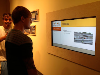
Type is obviously extremely important in information design and we found examples of great and terrible type choices at the Science Center.
This "Structure" interactive screen has a great cover with an appropriate typeface. The graphic pulled me in immediately. I love the design between the colors, shapes and typography.
 But unfortunately, as soon as you began the experience, it suddenly turns boring (see next photo). The structure of the piece is a simple grid with simple typography. It is lacking the movement, color and hype that is required for interactivity for children. It could have easily been more exactly by eliminating most the white space; bigger photos, more illustrations, etc.
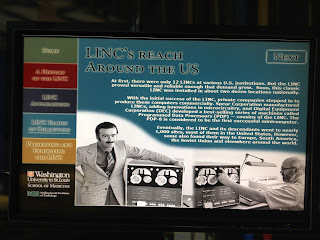
Here is example of typography that may have been the right choice if used correctly.
The interactivity was just as bad as the type and it was hard to stay involved when it only included large blocks of type.
This typeface was used all over the technology section of the Science Center. The typeface came straight out the 90s. It is extremely appropriate for the exhibit because all the technologies were from the 90s. With it's ancient computers and toys and cellphones from 1999 as examples for "new technologies", this exhibit was hard to stay engaged with.
This was one thing I did like. A print of different words on a wall that made light effects as you walked by.
I felt that all interactive pieces in the center could have been better but there were a few places where I felt that a print was just not enough.
I didn't think the Plantarium displayed the universe in a way that engaging enough or displayed the power of the universe. A large interactive TV could display the great distances or display the newest and greatest photos as they come available. An interactive Google Map could be fun also. Families could find their homes from space and relate where they live to where they are on Earth and in the Universe.
 Anatomy is also another great place for an interactive information piece. Great examples exist already of interactive pieces that allow users to learn about the body through an interactive experience. The great thing about interactive pieces is that the user can decide what they want to learn about. It doesn't require the user to sit through information that they don't want to hear about. It also allows children to stay involved and get excited about learning. This sculpture of the body is great but it doesn't tell me anything. I wanted to be able to see further into the body and learn about different organs.
 One major issue of the Science Center that I found was the lack of a good identity. They have an identity of course, but I don't remember what it was. Science is all about design and the Science Center lacked design and cohesion.
Fortunately, the building structure allows families to navigate the museum easily, which is great because they had no help from signage.
Here (left) is an example of a kiosk that allows you to buy tickets for events. As soon as I saw the interactivity (something that reminds me the first version of yahoo.com from 1995), I no longer wanted to investigate the types of events and how to buy tickets for them.
Blocks of type, bright colors, and all sorts of design elements were being put to shame in all sorts of kiosks. Children like, and need, pictures, clarity and focused stimulations. These kiosks provided none of that. It was clear to me why I saw no children enjoying any of them. I could hardly play with them while researching. It truly made me sad because there is an enormous potential being pasted by.
I didn't learn as much I could at the St. Louis Science Center and I was disappointed.
I hope one day the Science Center will be updated and its potential fulfilled. I would love to be apart of the company they gave that honor too.


No comments:
Post a Comment