Last week we presented our Capstone Project Process to three professionals, Patrick Keefe and Steve Mahn from HLK Agency and Christina Hughes from BigWideSky.
I presented my research, the beginning of my website and the progress from beginning of the project to what I have now. It went better than expected.
They were extremely excited about my research and how I used it to inform all my design decisions. They also appreciated my type and other aesthetic decisions.
But they did have a few suggestions. They enjoyed the video but they suggested spicing it up a bit by taking different shots from different angles and using those new angels through out.
The best suggested was about the movements of my website. The movement was one of the only thing that didn't have a clear validation. The suggestion was to use movement to communicate to the user what part of the website the user was currently experiencing. The website moves through several different sections, the introduction, the history, the future and the opportunity to support. Currently there is no clear indication that the user has moved into a new section so movement became the perfect solution. Each page of each section will move in the same way but each section will move differently.
My presentation went really well, better than I could ever hoped. They gave me great confidence and excellent advice that will improve my project and make it even better.
Saturday, April 6, 2013
Sunday, February 3, 2013
Washington Theater Research

What I have learned this semester is researching before designing can help your design and design process highly. The more I research on the Washington Theater Project, the more informed my project becomes.
The best research I have come upon lately is the report the Washington Theater Committee gave me. When they gave it to me, they thought it might possibly help me. Because they didn't seem so confident about it, I avoided it for several days and researched in my own direction. When I finally felt I should look at it, I was floored.
What they gave me is a feasibility report of the Washington Theater: 155 pages of in dept information about the competition, the demographics, the audience, and how the theater would work. It uses both qualitative and quantitative facts to show that the Theater would be very successful as a theater and at helping the city of Quincy if it was successfully restored. It told me that the theater has no competition and this is a need in the city of Quincy, as a way to generate revenue and to expand the arts and cultural experiences. This has become my bible of research because it tells me everything I need to know about how to build my interactive experience.
What surprised me the most, was how I feel this information is gold, and the Washington Theater Committee just sees it as a report. The Committee has fallen to Curse of Knowledge, a term used in the great book Made to Stick, that describes a person or business that can not get their idea out there because they don't understand what knowledge of their's is powerful. They get lost because they don't understand that their audience is not on the same level as them, they don't have the same knowledge.
I am going to use this information to my advantage and try to help the Washington Theater show the world what they're missing.
Monday, January 21, 2013
Capstone Beginnings

Since November of last year I have known what I wanted to do for my Capstone. I was researching the city of Quincy when I came upon this magnificent and very old theater, the Washington Theater. The theater had only been reopened a couple of years after being shut down in the 1980s. The theater was built in the 1920s with beautiful architecture that you can only find with buildings built from that era. But it had been abandoned for 30 years and now needs a major face lift.
Because of the Festival going on that weekend, they were letting people explore the inside of the theater and what I say when I went inside took my breath away. I automatically had the over-welling sense that I needed to do what ever I could to make the rehabilitation of this theater happen.
After research, I found that their current website was out dated as the theater: this was my opportunity. I knew this would make an excellent Capstone project because I had the passion but I still needed to learn everything about it. It had the potential of making not only a great story, but also a beautiful website.
After being excited about this project for two months, I finally began the process and came to my first problems (to be figured out). Who was my audience? How do I get my audience to care? How do I get my audience to react? How do I tell this story with a website?
With the help of some close students and friends of mine, we discussed how I could use story to have my audience care about the Washington Theater. We decided the best way to do this was to show them why bringing the theater back to life would be good for them and their city of Quincy.
As I continue on this project this week, I intend to do more research about my audience and the best way of telling a story through a website.
Saturday, January 19, 2013
Apple turns us down.
I interned with an excellent company in St. Louis for seven months, working on several projects but had the main focus of creating an iPad magazine for the design firm's newsletter. We used Adobe's Digital Publishing Suite to create our magazine and everything went very smoothly. After seven months of edits, we finally came to the final product and I was very proud of it.
When we wanted to publish, we ran into several problems. Our idea is that we would publish to iPad's Newstand because it was built for this exact thing we wanted to accomplish. What we didn't foresee is how costly it is to have a magazine in Newstand: over $1500 a year. This was not going to work for our small 4-issues-per-year publication.
What we did find, was that adobe offered this program called "Single Edition Apps". You could submit your magazine as an APP for free as long as you were an Adobe Member. This was not ideal, but it sounded like it would work..
After submitting to Apple, this is the response we were given after about 3 weeks:
 I and my mentor were blown away. We never expected this.
The first thing I learned from my mentor when creating the magazine was to not put anything interactive into the magazine just because I thought it needed more interactivity. We believed that less is more and we found that magazines with too much interactivity were overwhelming.
It was also very unexpected because we followed the examples and tutorials of Adobe Digital Publishing Suite very closely. I felt that they led us down this path into rejection.
We plan to appeal the rejection, but I do not have my hopes up. I can say, however, that this was just one more thing, out of the hundreds of things, that I learned during my internship and I am very grateful for that.
When we wanted to publish, we ran into several problems. Our idea is that we would publish to iPad's Newstand because it was built for this exact thing we wanted to accomplish. What we didn't foresee is how costly it is to have a magazine in Newstand: over $1500 a year. This was not going to work for our small 4-issues-per-year publication.
What we did find, was that adobe offered this program called "Single Edition Apps". You could submit your magazine as an APP for free as long as you were an Adobe Member. This was not ideal, but it sounded like it would work..
After submitting to Apple, this is the response we were given after about 3 weeks:

The first thing I learned from my mentor when creating the magazine was to not put anything interactive into the magazine just because I thought it needed more interactivity. We believed that less is more and we found that magazines with too much interactivity were overwhelming.
It was also very unexpected because we followed the examples and tutorials of Adobe Digital Publishing Suite very closely. I felt that they led us down this path into rejection.
We plan to appeal the rejection, but I do not have my hopes up. I can say, however, that this was just one more thing, out of the hundreds of things, that I learned during my internship and I am very grateful for that.
Monday, September 3, 2012
The St. Louis Science Center
A class I am very excited about this semester is Information Design. Last week we went to the St. Louis Science Center to see some real-world examples of information design, interactive and print. I was not impressed to say the least.
 Type is obviously extremely important in information design and we found examples of great and terrible type choices at the Science Center.
This "Structure" interactive screen has a great cover with an appropriate typeface. The graphic pulled me in immediately. I love the design between the colors, shapes and typography.
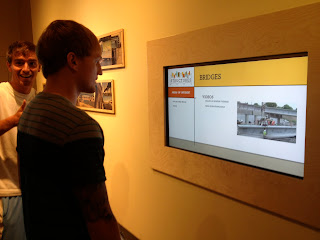 But unfortunately, as soon as you began the experience, it suddenly turns boring (see next photo). The structure of the piece is a simple grid with simple typography. It is lacking the movement, color and hype that is required for interactivity for children. It could have easily been more exactly by eliminating most the white space; bigger photos, more illustrations, etc.
 Here is example of typography that may have been the right choice if used correctly.
The interactivity was just as bad as the type and it was hard to stay involved when it only included large blocks of type.
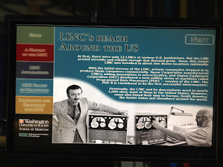
 This typeface was used all over the technology section of the Science Center. The typeface came straight out the 90s. It is extremely appropriate for the exhibit because all the technologies were from the 90s. With it's ancient computers and toys and cellphones from 1999 as examples for "new technologies", this exhibit was hard to stay engaged with.
 This was one thing I did like. A print of different words on a wall that made light effects as you walked by.
I didn't think the Plantarium displayed the universe in a way that engaging enough or displayed the power of the universe. A large interactive TV could display the great distances or display the newest and greatest photos as they come available. An interactive Google Map could be fun also. Families could find their homes from space and relate where they live to where they are on Earth and in the Universe.
 Anatomy is also another great place for an interactive information piece. Great examples exist already of interactive pieces that allow users to learn about the body through an interactive experience. The great thing about interactive pieces is that the user can decide what they want to learn about. It doesn't require the user to sit through information that they don't want to hear about. It also allows children to stay involved and get excited about learning. This sculpture of the body is great but it doesn't tell me anything. I wanted to be able to see further into the body and learn about different organs.
 One major issue of the Science Center that I found was the lack of a good identity. They have an identity of course, but I don't remember what it was. Science is all about design and the Science Center lacked design and cohesion.
Fortunately, the building structure allows families to navigate the museum easily, which is great because they had no help from signage.
Here (left) is an example of a kiosk that allows you to buy tickets for events. As soon as I saw the interactivity (something that reminds me the first version of yahoo.com from 1995), I no longer wanted to investigate the types of events and how to buy tickets for them.
 I did discover many interactive kiosks. Here is what most of them looked liked:
 Blocks of type, bright colors, and all sorts of design elements were being put to shame in all sorts of kiosks. Children like, and need, pictures, clarity and focused stimulations. These kiosks provided none of that. It was clear to me why I saw no children enjoying any of them. I could hardly play with them while researching. It truly made me sad because there is an enormous potential being pasted by.
I didn't learn as much I could at the St. Louis Science Center and I was disappointed.
I hope one day the Science Center will be updated and its potential fulfilled. I would love to be apart of the company they gave that honor too.


This "Structure" interactive screen has a great cover with an appropriate typeface. The graphic pulled me in immediately. I love the design between the colors, shapes and typography.
 But unfortunately, as soon as you began the experience, it suddenly turns boring (see next photo). The structure of the piece is a simple grid with simple typography. It is lacking the movement, color and hype that is required for interactivity for children. It could have easily been more exactly by eliminating most the white space; bigger photos, more illustrations, etc.
The interactivity was just as bad as the type and it was hard to stay involved when it only included large blocks of type.


I felt that all interactive pieces in the center could have been better but there were a few places where I felt that a print was just not enough.
I didn't think the Plantarium displayed the universe in a way that engaging enough or displayed the power of the universe. A large interactive TV could display the great distances or display the newest and greatest photos as they come available. An interactive Google Map could be fun also. Families could find their homes from space and relate where they live to where they are on Earth and in the Universe.
 Anatomy is also another great place for an interactive information piece. Great examples exist already of interactive pieces that allow users to learn about the body through an interactive experience. The great thing about interactive pieces is that the user can decide what they want to learn about. It doesn't require the user to sit through information that they don't want to hear about. It also allows children to stay involved and get excited about learning. This sculpture of the body is great but it doesn't tell me anything. I wanted to be able to see further into the body and learn about different organs.
 One major issue of the Science Center that I found was the lack of a good identity. They have an identity of course, but I don't remember what it was. Science is all about design and the Science Center lacked design and cohesion.
Fortunately, the building structure allows families to navigate the museum easily, which is great because they had no help from signage.
Here (left) is an example of a kiosk that allows you to buy tickets for events. As soon as I saw the interactivity (something that reminds me the first version of yahoo.com from 1995), I no longer wanted to investigate the types of events and how to buy tickets for them.


I didn't learn as much I could at the St. Louis Science Center and I was disappointed.
I hope one day the Science Center will be updated and its potential fulfilled. I would love to be apart of the company they gave that honor too.


Saturday, September 1, 2012
Crystal Bridges Museum of American Art

The website does not reflect the beauty of the museum. I was disappointed with it.
http://crystalbridges.org/


Tuesday, August 7, 2012
Kids in Christ Logo

This summer I am free lancing for Akers Chapel Community Church. This week they wanted me to make a logo for their new youth group Kids in Christ. The challenge was creating a logo to represent kids of all ages. I created four different options for them. The first three each have type that I hand-drawn and rendered. The last one uses Rockwell. They ended up liking the first one the best.
See it in action here >> http://akerschapelcommunitychurch.com/kidsinchrist.php
Subscribe to:
Comments (Atom)